  |
||
 |
 |
 |
 |
 |
||
| reference articles | competition journal | piping links | FAQ | contact me |
Andrew's Tips: Improving Band WebsitesBy Andrew T. Lenz, Jr., Santa Cruz, California, ©2004 - 2006This article discusses designing bagpipe band websites and how to avoid common pitfalls. It was originally written for The Voice magazine which is published by the EUSPBA. After finishing the article I was informed that a similar but much less exhaustive article appeared in the previous issue and as a result I had to edit out a few topics to avoid redudancy. If you are curious, you may read the published version from the Fall 2004 issue of The Voice, but what follows below is the complete article with a handful of revisions.
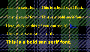
Through some cruel twist of fate, someone in the band discovered that you know slightly more about computers than the average bear—maybe not much more, but more—and before you can say “Ack!” you find yourself the webmaster of your band’s Internet presence, a.k.a. website. Now, before I go any further, if you are a seasoned web graphics design guru, this article probably isn’t for you. But if you don’t know your chmod from your unsharp mask, this will do you some good. (Sorry, I’m not going to tell you what those are, it’s “beyond the scope of this class.”) This is a “what to do” not a “how to do it” article. I’m assuming you have some web site authoring and also photo editing software and know how to use them. There are no secrets to making a website that will give the visitors to your site a pleasant experience and make them want to come back, but there are things to do and things to avoid. Here are some things to get you started on your web construction journey. Let’s start with text and backgrounds. You are going to be transferring tidbits from your brain into the brains belonging to your site’s visitors primarily through the written word. Surprisingly, some webmasters make the mistake of presenting very hard to read text. Tartan backgrounds are a tempting quagmire. The problem with a full intensity tartan is somewhere in that lovely plaid pattern is a color that’s going to be close enough to the color of your text to cause a contrast issue—hence poor readability.
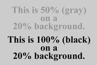
If you are going to insist on using that cliché tartan as a background, at least brighten it waaaaay up. (For this discussion I’m assuming you are using dark text). The most saturated color should be no darker than about 30%. (100% is black, 0% is white.) One site I visited had medium gray (50%) text on a light gray (20%) solid background, leaving a mere 30% contrast. Considering that’s less than a third of the readability of black on white (100% contrast), that’s pretty rotten. (If you are a photographer, your 18% mid-point gray doesn’t apply here, we’re using graphics terminology.)
And avoid neon colors, watering eyes are a good reason for a user not to come back. Oh, and if you haven’t calibrated your monitor using your operating system’s monitor controls, do it before you make contrast decisions or go changing the contrast and color in your photos. Maintain a consistent identity (same background and text colors) throughout your site. A visitor shouldn’t get the idea that they accidentally stumbled onto another site due to a radically different scheme of fonts and/or colors. If you are going to intentionally make your text small, use a san serif font—a typeface without the little wings on it—such as Verdana or Arial, which will be more readable at smaller sizes. Just remember small text will scare off older visitors who have to squint to see your writings. If you use relative sizes (extra-small through extra large) versus pixel based sizes, then your user’s browser text settings (small, medium, large) to be honored. Just like in a magazine, avoid using all capital letters. Don’t make text all-caps, bold and enlarged, simply doing just one of these three will make it stand out. ALL CAPS IS HARDER TO READ. STUDIES SHOW THAT IT IS MUCH EASIER FOR THE HUMAN BRAIN TO RECOGNIZE WORDS IF THEY ARE PRESENTED IN UPPER AND LOWERCASE. WHY MAKE YOUR VISITOR WORK HARDER? Now then, isn’t this better? Whew. Another formatting thing, don’t use the underline HTML tag. Most browsers underline links and if you have underlined text, this will frustrate visitors who won’t be getting what they expect, thinking things are a link when they are not. Speeling erors or wrong words cna make a site look very unproffessonal. No excuse these days. Though oven spell chick can’t replace hold-fashioned prove reading. Seems obvious, right? You’d think. Convenience is the name of the game. If the visitor to your site is inconvenienced by hard to read text, slow loading, obscure navigation, overly bright colors, then don’t expect many repeat visits. The point of your site is not to make you look like a bleeding-edge web designer, but to give the viewer what he or she wants. If you are going to use Flash, JavaScript, etc., you use it like a race car: very sparingly and wisely or use it "all out". In between those, it’s “squash like grape.” Definitely stay away from Java applets (the gray box with the coffee cup in it). They are a pain and really don’t add much value for their weight and download time, but don’t confuse it with JavaScript, that’s a different animal. An example of a well-done flashy site was AlbertaCaledonia.com—though it has since been redesigned. If all band sites were like this one, I wouldn’t visit too many of them. At the Alberta Caledonia site, you had to download about a third of a megabyte to get to actual band related content. One thing to keep in mind, as of Summer 2006, 30% of Internet users don't have high speed access. (As of Summer 2004 it was about 50%.) This means a significant (if shrinking) number of your visitors are still using a dial-up connection of 56K or slower. For a long time I was one of the many pipers who would rather spend money on reeds than broadband! Speaking of convenience, using a free hosting service that displays one or more pop-up windows of advertisements along with your band's web page is really annoying. Yes, it's free, but maybe your band can scrape together enough money to buy a large pizza and spend it on web hosting instead. Hosting is pretty cheap these days. And, if your band is a recognized non-profit, you might be able to convince a local web hosting company to host your site for free—they'll often require a small "Hosted by <whoever>" image on your home page, but that's much better than a bunch of annoying pop-up ads! A dedicated domain name for your band isn't all that expensive and goes a long way toward making your band look very professional. I mean, what looks better? http://www.ReallyCoolPipeBand.com or http://www.joebobshostingservice.com/~rcpb/ ? Your mantra can be “what would Amazon do?” Amazon.com spends BIG bucks researching the best way to design their site, and it’s very efficient. Granted, they are a retailer and therefore we can take some liberties from their model, such as discretely used “OnMouseOver” commands. (The “OnMouseOver thing” is like what you’ll find at SantaCruzPipeBand.com, an alternate image loads when the users mouse moves over a designated area, in this case the navigation. It doesn’t have to be a radically different image, it can just be a little highlight. I’m not the webmaster for our band’s site, but it’s quite well done.) An example of superfluous stuff, don’t put clocks on your pages. I have a clock in the room and on my computer. I don’t need another clock, unless for some reason I really need to know what time it is where you are. The only clock I ever liked was one counting down to the Worlds—it gave me several bits of information, the band was a competition band, what they considered their more important performance and how much time they had left to prepare. Obvious navigation is extremely important. Make sure your visitor can find their way around easily. What good is a fancy bathroom if you can’t find it when you need it? And create a page for each logical chunk of your site. Band member biographies on one page, awards on another, practice information on another, etc. If a page starts getting really big, consider breaking it up into several smaller pages. Avoid using frames for your site. Two reasons. One, a visitor can’t bookmark a specific page on your site—for example, they are prevented from jumping right to your calendar page. Second, search engines have a nasty habit of linking to pages that should be appearing inside of a frame navigation structure. That is, someone heads from Google to your site, and ends up on a page without a means of clicking to your home page—or any other page for that matter! Sure, a visitor can just manually edit the URL to your site’s root, but that’s not very elegant, now is it? Yes, there are exceptions to everything, but it’s best to do without frames. When a page is bookmarked (or added to a user’s “favorites”), the page title becomes the name of that bookmark, unless the user changes it manually. On your browser, right now, you could have ten bookmarks for “Home Page,” each to a different site! Title your pages so the bookmarks/favorites titles make sense out of context. If you have a links page, title it something like “Imaginary Pipe Band’s Links” not just “Links” and not just “Imaginary Pipe Band”. Speaking of names, also include your band’s name in text on your home page. Search engines can’t read a spiffy masthead image with your band’s name in it. But they can read the page title and the text on your page. So if you want to make it easier on those poor lil’ ol’ search engines (and blind visitors), include your band name in both. Use the “alt” (alternate description) text on images and use the H1, H2, H3 tags, it is not only good HTML, accessible to disabled users, but helps search engines recognize important headers from regular page text. Ah, images. Avoid clip art like the plague. People want to see original content specific to your band, not the same overused thing they’ve seen on a bunch of other sites. In this day and age of cheap digital cameras, there’s no reason that you can’t easily add some decent photos of your band in action on your site. At least one photo or graphic on each page is a good rule of thumb. Crop your photos down to the action. (I know you think that Port-a-Potty on the left is interesting, but yuck!) If there are a whole lot of images, spread them over several logical bite-sized pages. It’s much more palatable to load 10 pages of 9 images each than one page of 90 images! If you are going to include large photos (say, over 50K) on your site, create a thumbnail image (small file, less than 10K) so the user can decide whether they are willing to spend their time downloading a big image file. But don’t make your thumbnail so small that the subject matter is unrecognizable. Include a description with your photos. People are curious: “Where were these taken?” “Who are these people?” “What are they doing?” Though I don’t recommend going overboard with photos on your site, if you do want to post lots of photos on an ongoing basis, you might consider automating it a bit to save yourself some time. If you have PHP support on your server (check with your web hosting service), a simple to use freeware package is Gallery: Photos should be saved as JPEG files—you’ll usually want to use medium or medium-low quality. Diagrams or illustrations with only solid colors should be saved as GIF files. Why? Best performance for the file size and quality. (PNG files are starting to make an inroads versus GIF files, but GIFs are still more universal.) And make sure your images are optimized for the needed size. Don’t just have the browser shrink it to the desired size, it’ll still have to download more information than it is going to use. Use your photo manipulation software to make your photos the actual required size. One web design web site proclaimed “Death to splash screens!” What is a splash screen, you ask? It is an entry page to a site that is, well, splashy. It’s intended to be flamboyant, but usually contains very little information, similar to the cover of a book. The idea is to entice your visitors into your site, make them crave more. Users do want information, but a splash screen is a barrier to the users getting quickly to that information. If you are going to have a splash screen either create it to load very fast or make it very easy for the visitor to “opt out” and head onto the meat of your site. Also a splash screen should be unique and interesting. One site I visited presented information on the splash screen virtually identical to the information found on the main page that followed, defeating the point. A quick word on copyrights: just because something is posted on the web doesn’t mean that it’s yours for the taking. Maybe that photo on that other piping site would fit perfectly on yours, but hold yourself back. The same goes articles. And music. Don’t go posting sheet music on your site unless it’s in the public domain. Traditional tunes are only fair game if you create the sheet music or the book from which it came is so old it’s out of copyright. Do your homework and ask permission if necessary. It’s 11:30 p.m. and your spouse is asleep. You click on a link, up comes a band’s site, and WHAM!! Your computer blares Scotland the Brave at 500dB! Your spouse screams, the neighbors call the police, the kids wet their beds, windows break! Is this really what you want your visitor to experience? Don’t get me wrong, sound files are great—just don’t force feed them. Plus, sound files slow down your page load—bad. Be polite, ask first. Create a page dedicated to sound bites of your band’s performance or CD. Remember to check with your web hosting service to make sure that you won’t exceed your bandwidth allotment (amount of data that you can transfer) by posting big sound files. If you overdo it, your site might be shutdown and be temporarily unavailable to anyone. Some pages to consider having on your band site: history, instruction, practice, contact information, music, how to join, calendar, book the band, past events, photo album, links, roster, and perhaps a site map if you site is big. Don’t forget to link back to your home page and if you have a big band logo image at the top of each page, use that to link back to your home page as well. If you are going to include a calendar, keep it updated. It’s disheartening to discover an exciting band only to find that their upcoming events are in 2002. Updating goes for members, repertoire, practice time/location or anything else that changes with time. Short biographies of players with a photo are a nice addition to a band site. If a member wants a long one, have them go find a book publisher. A hundred words or even much less usually gets the job done—perhaps a bit longer for the chief mucky-mucks, like the pipe major. A benefit of such a online roster is the ability for new band members to acclimate faster, that is, having an easier time putting names to faces and getting comfortable with bandmates. The downsides of online bios are a lack of privacy, easier poaching by any nearby bands (if that’s a concern), plus the maintenance required to keep the roster updated. Make sure you get permission from your members before posting details about them. If the band decides against a public roster, a private one in a protected “members only” section is a possibility. (Don’t link to your “members only” section with a label of “members”! People will think it’s a roster!) If you are going to have a guest book, make sure you are ready to commit the resources to monitor it for objectionable material. Swear words, links to obscene sites, jokes in poor taste, Pakistani advertisements or other content that might prevent your visitor from returning. Are you really ready to turn over a portion of your site to your visitors? Just be aware. Remember to include on your home page where your band is located, that means more than just city or county, that means state/province and/or country as necessary—the more, the better. Sure, if you are in Los Angeles, that’s probably enough. But if you are in Yreka—or any other place that a foreigner couldn’t easily point out on a map—you better tell them at least the state! It is the World Wide Web after all! I hate having to dig to figure out in what country a band is located. Also right off the bat, you should let your visitor know what kind of band you are, street band, competition band (and what grade), any band associations you belong to, any organization that you are associated with (school, charity group, fire department, etc.). A means for a visitor to contact your band should be easy to find and complete. Offer them as many options as your feel comfortable, e-mail, mailing address, phone number. Give them the name of the appropriate contact person. A photo would be a pleasant personal touch. E-mail addresses. If you have an e-mail account, I don’t have to tell you about the need to protect your address from spammers. Spammers use harvesting programs to pick e-mail addresses off of web sites. Means of preventing this unpleasant occurrence include using a contact form (talk to your web hosting service), posting GIF images of each e-mail address (visitor types what they see), or encoding addresses so they look like “%6E%6F%74%61%72%65%61” in the raw HTML source code. A page that encodes addresses for you is this one: A nice touch would be to use this encoding method and a GIF image of the e-mail address so people can see the address that will appear when they click on a link to an encoded e-mail address. Avoid using special characters in your file names. Stick with letters and numbers. If you want to use a space, consider using a dash (-) instead. (Unfortunately, underscores can be read as a space in linked text.) A domain name is not case sensitive, so feel free to use capitals on business cards, programs, etc. to improve readability, i.e., ImaginaryPipeBand.com. However, folders/directories and filenames in your path can be case sensitive depending on the web server. Let’s take a look at this URL: http://www.ImaginaryPipeBand.com/sound-files/Amazinghaggis2.mp3 If the file is really “amazinghaggis2.mp3”—note the lowercase letter ‘a’—their browser might not find it. Something to watch out for is those forward slashes (/). Some programs—Microsoft makes such a one—occasionally erroneously generates a back slash (\) in the path, which is in complete violation of decades old Internet conventions. Some browsers—Microsoft makes such a one—reads those bad paths anyway. So while this path may look great on your system, it may choke and die on others. This brings up the good practice of checking your site on different browsers and different operating systems. One in fifty visitors to your site will be using a Macintosh computer—like most of us graphics types—so you should consider checking your site under that operating system also. Some sites include a list of suggested browsers; however, people don’t like to be told they should switch from their browser of choice to view your noncompliant site. Make your site work for all common browsers and test your site using the latest versions. If you know that some feature you stubbornly just absolutely have to use won’t be supported by a particular browser, don’t use a redirect (a command that automatically sends a user to an alternate page), just have a link on the standard page that offers the visitor a page that is designed to work with their browser. If you are looking for ideas for your band site, you can visit: If you find that after reading all the above you really don’t want to do it by yourself from scratch, and have some money, consider hiring a professional. I was fortunate enough to have Echo Alley build the templates for my site, BagpipeJourney.com, using material from my old site. Then I just filled in all the content. While it can cost a bit of money, the pros can set up the skeleton and then you edit and add pages yourself— a poor man’s very professional looking site. (Well, maybe not exactly poor!) There are even hosting companies that can allow you to edit pages using just your web browser. Through Echo Alley, I was introduced to TechMeridian’s Xaviour hosting solution, which takes a template and allows you to edit the text of a page just through a web browser. This allows you to delegate responsibility of updating pages. If “Joe” keeps complaining that the band schedule is out of date, heck, he literally can do it himself! I do all my own editing of my site, but Xaviour may be the thing you just have been looking for. Once your band site posted to the Web, submit it to Dunsire’s Bagpipe Web Directory, Google, Yahoo!, Dmoz.org and any other directory you wish. Once you have it listed on a few sites, all the search engines will sooner or later pick it up and add it to their database. One last suggestion: however you do your band site, make sure that more than one person has a copy of the site’s source files as well as access information (server, username, password, etc.). When your webmaster leaves for college or quits in a huff, you’ll want to be able to continue to make changes easily to the band’s site. All right. Hopefully, that gave you some things to mull over while you are getting accustomed to your new journey as band webmaster! If you have any questions, feel free to visit the Webmaster & Software forum (of which I’m the moderator) at BobDunsire.com.
This page last updated Sunday, March 14, 2010. |
| sitemap | ||